ShopDreamUp AI ArtDreamUp

Deviation Actions


Description
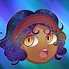
Here is the poor design reference for the general. I wanted to add his normal appearance but I felt it would be better to reveal it within the the plot.
I have been hiding that wrist bracelet he has. The other members have the same one as well.
I still have yet to finish the fourth member of his team squad thing.
Here is some name facts!
Fitting the military theme, his last name Hua is also a military term known as Heard. Understood. Acknowledged.
It also a Asian last name that means to prosper.
His members also have meanings behind their names.
If you want more fact I could make a journal for them. Or you could look for them on your own.
Please comment below about this!
Oc reveals
opalpal.deviantart.com/art/The…
opalpal.deviantart.com/art/The…
opalpal.deviantart.com/art/The…
Image size
2000x1817px 1.11 MB
© 2017 - 2024 OpalPal
Comments9
Join the community to add your comment. Already a deviant? Log In
Hello, my name is Vern and I am here from  and I am critiquing you for More Exposure #26
So anyway, here is my critique.
This is a reference picture showing the front, back, and portrait. There is also a picture of a bracelet.
Background
The background is real nice and accents the character very nicely. I like the dark color border and it adds a nice touch.
Portrait
The face is smoothly and well drawn. The hair is a nice color of brown. It is nicely shaded, however, it is not highlighted. The hair is just fine though. I like it that the hair on all three figures is virtually the same. i couldn't do that so I appreciate how it is done.
Jewel- looks fine and I like green.
Eyes - They look fine. Although, they could benefit from slightly bigger pupils. The tattoos under the eyes are fine but where are they on the front full body picture? The face and the neck are well highlighted and shaded. The clothes are fine. Excellent job.
Bracelet
It doesn't look metallic enough. the green cabochon looks okay though.
Back View
The proportion is off. The legs are too short. Therefore the arms and the body are too long. The head you got down. The torso and the legs look good even though they are out of proportion. the hands seem off. The fingers are too narrow and pointed. the thumb or the hands in the back view are reversed. The front view has the thumbs right but the thumbs are on the opposite side of the hand in the back view. don't like the shading on the right hand, it makes it look as if the fingers are cut. The shading is all wrong on the right hand because the shading is on the outside of the hand. Shading on the inside of the hand looks spot on.
Clothing the flap on the boots almost touches the ground on the back view but ends mid boot on the front view. I think the clothes and the beret are really good.
Front View
Same with the back view. I really like the cape though.
Conclusion - Your technical drawing is excellent and you will go far. The heads are excellently done. Your proportions are off. I believe that you will improve immensely. I really liked critiquing you. Have a great day.
and I am critiquing you for More Exposure #26 More Exposure #26ProjectComment is a Group that provides Guaranteed & Constructive comments for the DeviantArt community, but we aim to feature under-appreciated artwork too!
This article series will highlight works submitted to the More Exposure folder. Submit your pieces to this folder for more exposure on our front page and a news article! Submission limit is five deviations per week.
Before you submit, please comment on some of these pieces!
If you do, link your comment below for a chance to be featured in the monthly newsletter!
:origin()/pre11/4204/th/pre/i/2017/090/0/6/hecate_nikkal_hua_reference_by_opalpal-db471vh.png)
:origin()/pre04/3a9a/th/pre/i/2017/076/8/9/the_perfoming_donation_lieutenant_by_opalpal-db2lsdr.jpg)
:origin()/pre12/8fcd/th/pre/i/2017/083/9/b/creature_designs_by_butwhywhywhy-db3d38q.jpg)
:origin()/pre10/a297/th/pre/i/2017/083/0/6/30_day_rpg_challenge___environment_designs_by_butwhywhywhy-db3d40t.jpg)
:origin()/pre03/6f49/th/pre/i/2017/087/a/6/weapon_design_by_butwhywhywhy-db3w5xc.jpg)
:origin()/pre13/297e/th/pre/i/2017/088/9/f/broken_by_umwammy-db3wsm3.jpg)
:origin()/pre00/0fad/th/pre/f/2017/090/7/1/the_strings_that_pull_our_hearts_apart___desc___by_wolfythefallenangel-db46y0y.jpg)
:origin()/pre00/01e2/th/pre/f/2017/090/9/d/khrost_yay_by_puffi32-db46y70.jpg)
So anyway, here is my critique.
This is a reference picture showing the front, back, and portrait. There is also a picture of a bracelet.
Background
The background is real nice and accents the character very nicely. I like the dark color border and it adds a nice touch.
Portrait
The face is smoothly and well drawn. The hair is a nice color of brown. It is nicely shaded, however, it is not highlighted. The hair is just fine though. I like it that the hair on all three figures is virtually the same. i couldn't do that so I appreciate how it is done.
Jewel- looks fine and I like green.
Eyes - They look fine. Although, they could benefit from slightly bigger pupils. The tattoos under the eyes are fine but where are they on the front full body picture? The face and the neck are well highlighted and shaded. The clothes are fine. Excellent job.
Bracelet
It doesn't look metallic enough. the green cabochon looks okay though.
Back View
The proportion is off. The legs are too short. Therefore the arms and the body are too long. The head you got down. The torso and the legs look good even though they are out of proportion. the hands seem off. The fingers are too narrow and pointed. the thumb or the hands in the back view are reversed. The front view has the thumbs right but the thumbs are on the opposite side of the hand in the back view. don't like the shading on the right hand, it makes it look as if the fingers are cut. The shading is all wrong on the right hand because the shading is on the outside of the hand. Shading on the inside of the hand looks spot on.
Clothing the flap on the boots almost touches the ground on the back view but ends mid boot on the front view. I think the clothes and the beret are really good.
Front View
Same with the back view. I really like the cape though.
Conclusion - Your technical drawing is excellent and you will go far. The heads are excellently done. Your proportions are off. I believe that you will improve immensely. I really liked critiquing you. Have a great day.